
What makes a good chart? That’s perhaps too contentious a question for a simple answer. And, of course, it depends on context. So let’s do the classic science manoeuvre and replace a hard question with one that’s sort-of similar but much easier to answer:
What should we remember to think about when making a chart? I’m talking about a professional context here, not a school one – exam boards have their own requirements and you should use those, not mine, if you’re working for an exam.
So here is my chart checklist. When you’re under pressure – high stakes, short of time, or both – it’s easy to get tunnel vision and forget something. Which is, of course, the very worst time to forget something. That’s one of the reasons why a checklist that you are in the habit of always using is so valuable. If airline pilots with tens of thousands of hours of flying experience can use checklists, you can too.
It’s important to note this isn’t a list of requirements for all charts. It’s a list of questions to remember to consider. It’s totally Ok for the answer to be some form of “No, because in this case …”.
However, to get the benefit of it being a checklist, it is important to go through the list in order and make sure you actually do have an answer to each question – or added it to your to-do list – before moving on to the next one.
On to the list!
- Do you know who the audience is, and does this chart suit them?
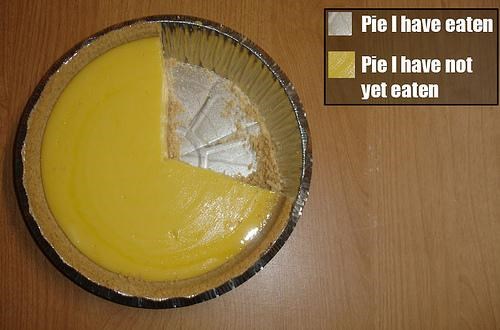
- Do you know what conclusion you want them to draw from it?
- Will that conclusion be obvious to your audience from your chart?
- Does the chart show something that should be shown graphically?
- Would a table or some other format be better?
- Is this type of chart the best option?
- Are the axes labelled? Including units?
- Are the axis ranges the best choice?
- If they don’t include zero/the origin, is that right and is that clear? This from the ONS is a useful overview of the issues around including zero.
- Could the chart mislead?
- If you’ve done something cute, clever, or otherwise not a completely standard chart – e.g. axes that are inverted, truncated, or log, or data that’s transformed or selected – will that be clear to your audience and understood by them? (Remember the Reuters graph of gun deaths in Florida, where they inverted the y axis and coloured it red to try to convey blood dripping, but it ended up looking like deaths went down, not up, after a controversial ‘Stand Your Ground’ law.)
- Does it have a good title?
- Does it have a good legend?
- Does it have the right caption(s)?
- Does the caption include the data source? If not have you put it somewhere else?
- Does the caption have enough to work as ALT text or do you need more?
- Is the text big enough?
- Does the chart have the right annotations?
- None is often right, but not always
- Colours:
- Are the colours meaningful?
- Have you made the right choice of categorical/sequential/diverging palette?
- Is it colourblind-safe?
- Is it greyscale-safe? (e.g. if printed)
- Are the categories in the best order?
- Does the legend order match the category order?
- Are you sure the data is correct?
- Have you done a premortem on how it could’ve gone wrong?
- Would the chart be worse if shown across more, or fewer, charts?
- Does it look good?
- Is it free of chart junk? Does everything on it need to be there?
- Have you documented the whole process of making it?
- If not, is there an obvious tweak you may well need to make in future, that it’s obvious how to do now but may well not be if you come back to it in a hurry? If so have you left yourself an explanatory note somewhere you will find it?
- Is the intellectual property situation Ok?
- Have you addressed the challenges a smart person who disagrees could make? (this may or may not be better done in the text)
- Do you know who’s paying for all this, and are you Ok with that?
- Is it morally right to show this chart in this context?
This list can’t guarantee data visualisation success, but it can at least help you avoid the obvious and well-known ways to fail. And that can get you a surprisingly long way.
May all your charts be beautiful and informative!
—
This work by Doug Clow is copyright but licenced under a Creative Commons BY Licence.
No further permission is needed to reuse or remix it (with attribution), but it’s nice to be notified if you do use it.
